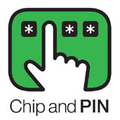
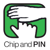
 Part of the problem with Chip and PIN is the logo. It subliminally tells you to use one out-stretched finger to type in your PIN, in full view, as clearly as possible to any onlookers.
This seems to be the wrong message. There are plenty of things wrong with Chip and PIN, but mostly it isn’t an intentional lowering of security. (In fact it mostly seems to be about shifting liability onto the consumer). But this logo doesn’t even seem to be trying to get it right.
Now, I’m no artist, so if you are disturbed by unnatural-looking hands, look away now.


Comments
4 responses to “Chip and PIN”
They’d look more natural if they weren’t two right hands 😉
I totally agree with you but not sure about the logo – you may have two left feet but not two right hands 😉 Also it looks vaguely like a rude gesture so maybe I could help refine it a bit with you?
Two rights don’t make a left. Oh well, there goes the graphic design career.
Mustn’t … visualise … goatse …
NOOOOOOO