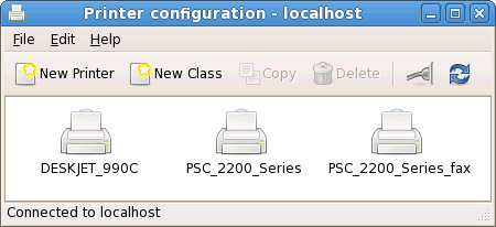
![]() I spent a bit of time today experimenting with making the system-config-printer user interface look a bit more like the gnome-cups-manager interface did, after several people mentioned they preferred it. The aim is to make it look less cluttered, more friendly, and generally cleaner. This is the first time I’ve used an IconView in GTK+ and it’s much easier to use than I had expected. Screenshot below.
I spent a bit of time today experimenting with making the system-config-printer user interface look a bit more like the gnome-cups-manager interface did, after several people mentioned they preferred it. The aim is to make it look less cluttered, more friendly, and generally cleaner. This is the first time I’ve used an IconView in GTK+ and it’s much easier to use than I had expected. Screenshot below.

The printer properties and server settings are now in separate dialog boxes, although it doesn’t all work correctly yet.
I’ve checked this code in to the ‘new-ui’ branch.

Comments
9 responses to “New (old) user interface for printer configuration”
this is how i want it to look like. will we have it in f9??
Ooh.
May I make two requests?
1. The two “New” buttons ought to have different icons if possible.
2. Could there be a way to rename printers? cupsaddsmb is really fragile and I’ve had issues with printer names being too long. Plus the default name was pretty bad.
pirast: Not for Fedora 9, but hopefully for the release after that. This is all still a bit experimental and doesn’t work properly yet.
David B.:
1. The “New” buttons: well, actually the way gnome-cups-manager did this was to have a ‘New Printer’ icon, with a star emblem on the printer icon. I was thinking about doing the same thing. We also need icons for ‘class’ and (possibly) ‘remote class’.
2. I’ve been asked about renaming printers before, and it’s technically possible but a bit tricky. The existing queue needs to stop accepting new jobs, and be copied to a new queue, all existing jobs in the queue need to be moved to the copied queue, and then the original queue has to be deleted and the copied queue set to accept jobs. It would be great to have that working, it’s just not trivial.
David B.: Oh, also, if you have any suggestions for improving the algorithm for selecting the default name for auto-configured printers, I’m listening. 🙂
It seems Add Printer is used in the menus and New Printer (= create?) in the toolbar (in the old version at least).
Perhaps making both Add would be best.
Anyway, I’ll be more than happy to help you out with any icons you need!
Andreas: some help with icons would be fantastic! Here’s what is missing:
* An icon to represent a class, i.e. a group of printers that is treated as a single job destination. When a job is printed to a class, the first available printer in the group gets given the job; if that fails, it gets given to the next one in the group, and so on. Something suitable might be an icon of several printers.
* An icon to represent a remote class, i.e. a group of printers that is defined by a remote CUPS server, not the local CUPS server running on this machine. Not sure if this is needed, but we will certainly be making the distinction between printers defined on this machine and printers defined on a remote machine. What do you think — is ‘remote class’ needed?
Looks very clean… nice.
can u pl link d code?
Look here to see how to get the source code.